See Your Microsoft 365 Collaboration Clearly: The nBold Analytics Dashboard
nBold turns every deal, project, or onboarding into a Microsoft 365 workspace that starts structured and governed from day one. But structure alone doesn’t stay under control on its own — once hundreds or thousands of spaces are live, IT still has to actually see the estate to keep it that way: whether templates are being adopted, which spaces have gone quiet or risky, where storage is piling up. Without that visibility, admins are left guessing instead of governing. The Analytics dashboard gives them the full picture in one place, and turns any insight it surfaces into a fix with a single click.
What’s new
Analytics is available now from the nBold app menu, in Microsoft Teams or the browser. It’s organized into five sections:
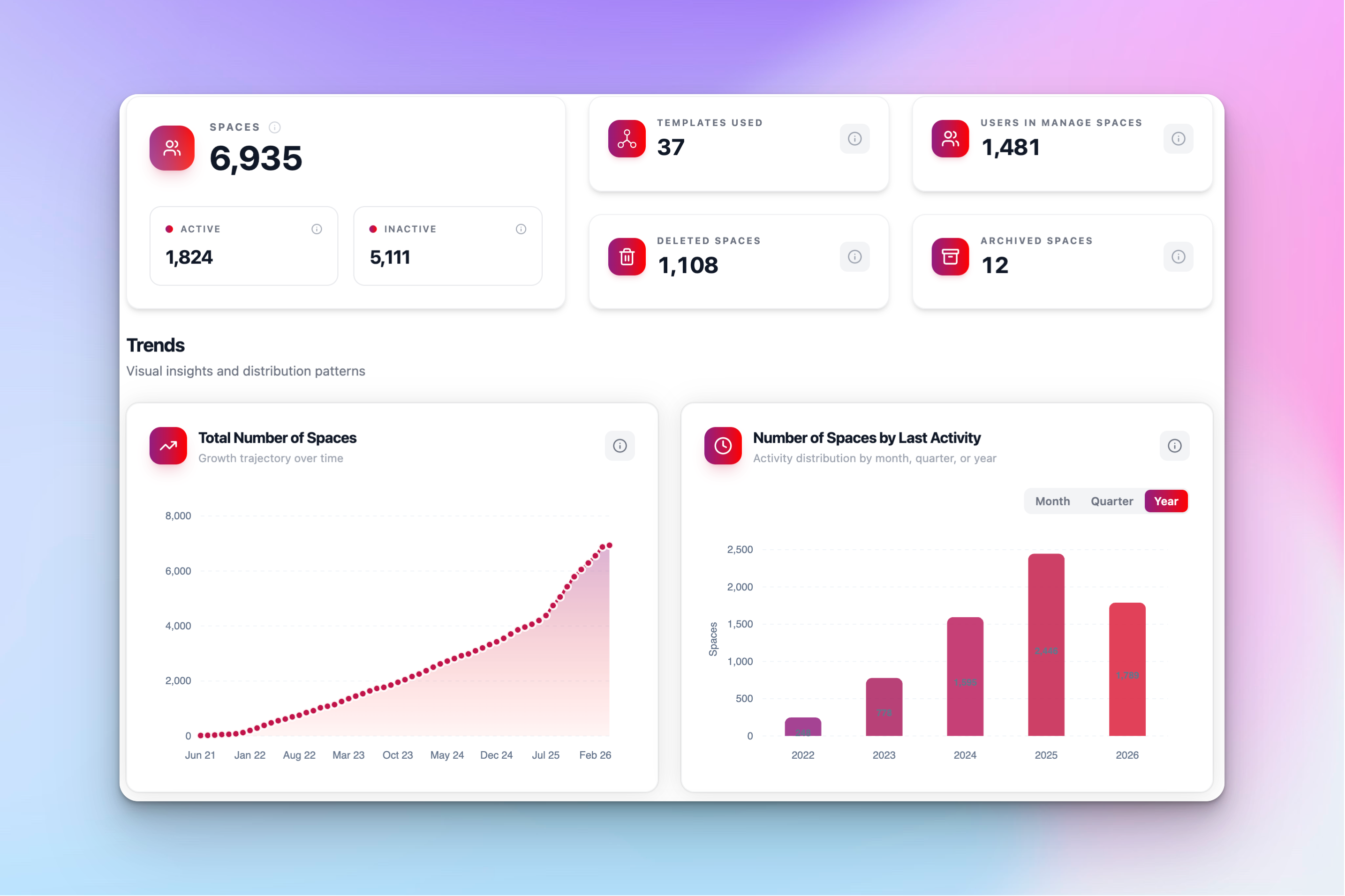
- Overview — total spaces (active vs. inactive), templates used, users under management, and trend charts for growth, activity, and template adoption.
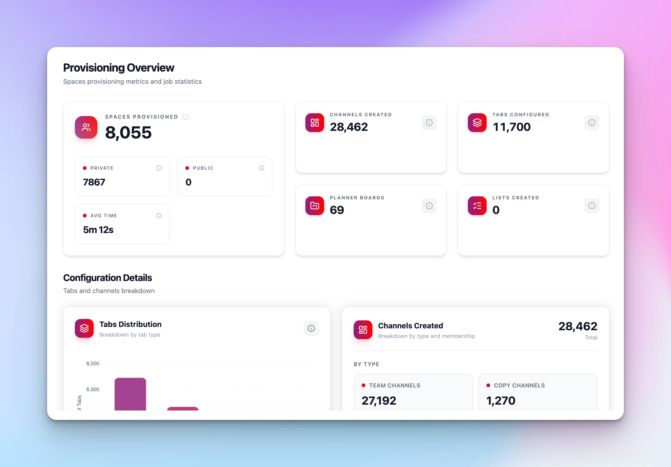
- Provisioning — spaces, channels, tabs, Planner boards, and Lists deployed, plus success rate, average provisioning time, and a searchable job log.
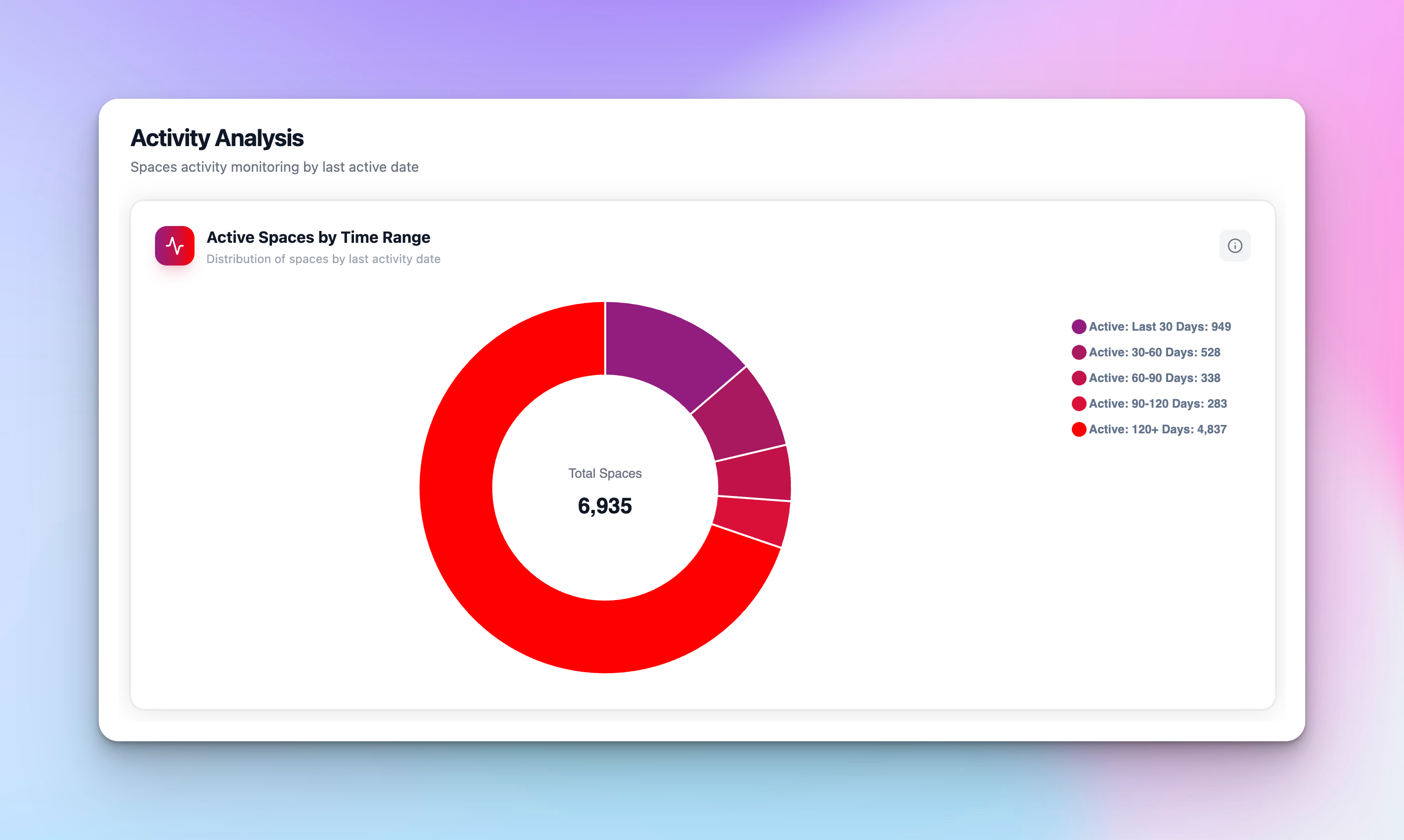
- Activity Analysis — spaces bucketed by how recently they were used, approval-workflow counters, and Spaces at Risk: single-owner, single-member, guest-holding, ownerless, or memberless spaces.
- Membership — average owners, members, and guests per space, with a distribution chart across your whole estate.
- Storage Overview — quota utilization, estimated savings, and the top 10 spaces by storage consumption.
Every section shares the same filter bar — saved views, template/metadata filters, and a date-range picker — so you can scope any chart to exactly the slice of your environment you care about.
How it works
Open the nBold app, click the menu icon, and select Analytics. The dashboard opens on Overview by default, giving you total spaces, templates used, and users under management at a glance, alongside growth and adoption trends.
Switch to Provisioning to see what nBold has actually deployed into Microsoft 365 — spaces, channels, tabs, Planner boards, Lists — along with success rate and average provisioning time. A job log at the bottom lets you filter to Failed jobs so you can spot and retry anything that didn’t go through cleanly.
Activity Analysis is where governance gaps surface. A donut chart buckets every space by how long it’s been since anyone touched it, and the Spaces at Risk panel flags the specific patterns that matter: spaces with only one owner, spaces with a single member, spaces holding external guests, and spaces with no owner or no members at all.
Found something that needs fixing? Hover over any insight card for about a second and a Bulk Action button appears. Click it and you land directly in Bulk with that exact list of spaces pre-loaded — ready to notify owners, add a member, remove a guest, or run any other bulk operation, with no manual searching or filtering in between.
Why it matters
Most governance tooling stops at reporting: it tells you something is wrong and leaves you to go find it. Analytics closes that loop. Spotting 42 spaces with no owner and turning that into a bulk notification takes one hover and one click — not a support ticket, an export, or a re-filter in a different screen. For admins managing hundreds or thousands of spaces, that’s the difference between an audit you dread and one you run every week.
Related
Analytics is one piece of nBold’s broader governance model — see how templates, lifecycle policies, and approval workflows work together on Governed Microsoft 365. Want to see it running against your own tenant? Book a demo.